
Theme Color Selection
Choosing the right color themes for Decode Daily’s 2.0 update.
The “Big Bang”
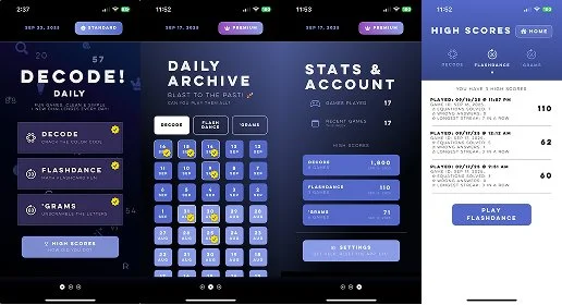
When Decode! Daily launched its 1.0 version, it featured a single color theme for the UI (now named Cosmos).
Inspired by Seattle's night sky and the mysterious blue murk of a Magic 8 Ball, Cosmos set the tone for the game's overall aesthetic—dark, contemplative, minimalist, and perhaps a little magical.
With the launch of 2.0 this week, I'm excited to introduce three (3) new themes, each named after a city that's shaped my life and work: Carbondale, Cambridge, and Clearwater.
Carbondale: When Sky Catches Fire
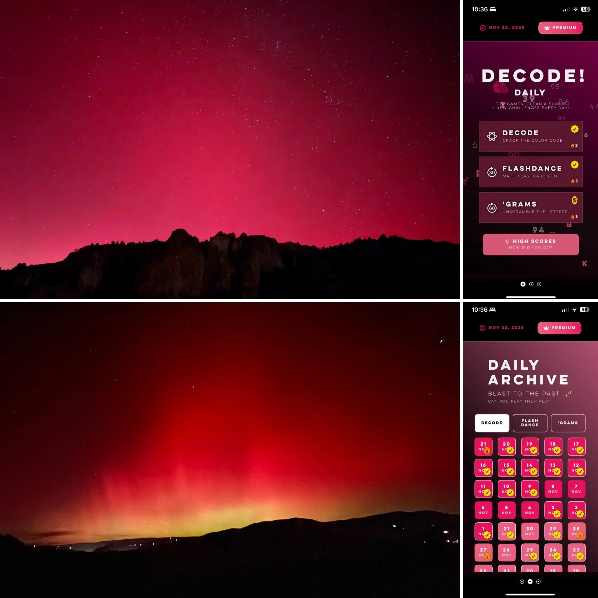
The idea to build themes for the app was brewing but had not taken clear shape... I was unsure which direction to take my colors, and felt fond of the deep blue blacks. Then, one October evening, I received an unexpected gift in the form of a photograph of the Aurora Borealis dancing over a Rocky Mountain skyline. This text from Colorado mesmerized me—the sky was ablaze with deep maroons, reds, pinks against the dark contrast of the earth.
I knew immediately this had to be the next theme. It felt like the perfect counterpoint, and a stunning contrast against Cosmos's cool blues. Where Cosmos is calm and introspective, Carbondale is vibrant and electric.
(aurora photo attribution: Dr. Colin Galbraith)
Cambridge: Jewel Tones and Irish Pubs
After establishing two themes, I decided a well-rounded set of four would give players real variety. I wanted to continue with jewel tones to maintain visual cohesion across the collection.
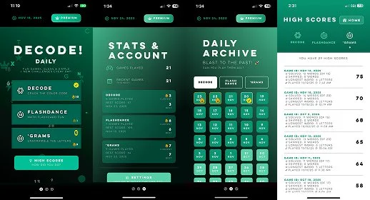
Green felt like a natural next direction.
I attended college in Cambridge, MA, and knew I wanted to name a theme after this beloved town. Rather than default to my alma mater’s colors (red. silver, gray)—too similar to Carbondale—I drew inspiration from the neighborhood's many Irish pubs. This particular shade of emerald green captures the warmth and character of those spaces, places where community and conversation flow as freely as the Guinness.
It also represents the greens of the city in the springtime, when it comes alive after a deep New England winter. And, it’s my subtle homage to the immigrants across the United States who came and settled here, whether that was once the Irish in the late 1770’s like my own Scotch-Irish ancestors, or those arriving today from around the world. Green is a color of luck. 🍀
Clearwater: A Technical Pivot with Heart
The fourth theme, Clearwater, went through the most evolution.
Named after my Florida hometown, it was initially going to feature pastel shades—Miami Vice-inspired turquoises, pinks, and yellows.
But when I implemented it, the design didn't work. Because all my other themes use deeper jewel tones, the pastels created inconsistent contrast ratios, strange drop shadows, and too many instances of text that needed to be flipped from white to black (or vice versa).
TL;DR it created more technical debt than I wanted to take on.
I decided to pivot, and stripped the theme down to the color I liked most: a rich purple shade.
It reminded me of my grandmother, Mary, who loved purple. She and my grandfather moved to Clearwater when they were young, and are buried there to this day. Mary was a talented artist, and two of my favorite heirlooms were passed on from her: a portrait she painted of me as a child (on a purple background) and a jewelry box she painted and hand-lettered for me (also, purple, with pops of color).
I kept some bright turquoise in the mix so the Florida-vibe was not completely lost. The result honors my grandmother and my home state, while staying true to the design system's technical requirements.
Why Cities and the Cosmos
You may notice the new themes are named after cities, with Cosmos the lone exception. Cosmos came first, and set the foundation. It was the spark that launched the others.
Each city-named theme is grounded in real places and memories, turning what could have been arbitrary color choices into something personal. The app is a labor of love, and I want this love to be infused in every small decision as I continue to build more capabilities and learn about new customer needs.
Design, in my opinion, should always a balance between aesthetic vision and technical reality, between personal meaning and user experience.
With these four themes, I hope Decode! Daily 2.0 players find one that resonates with them—whether it's the mystery of Cosmos, the fire of Carbondale, the warmth of Cambridge, or the vibrant nostalgia of Clearwater. Or perhaps the colors invoke something personal in each user that will forever exist beyond my grasp—fitting their mood, spirit, or own nostalgic memory.
♥ megan